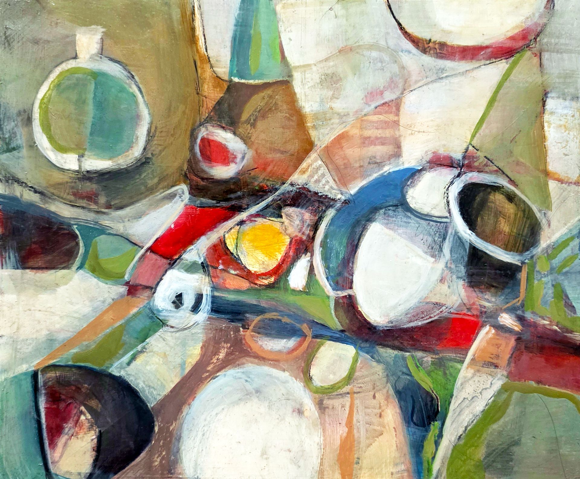
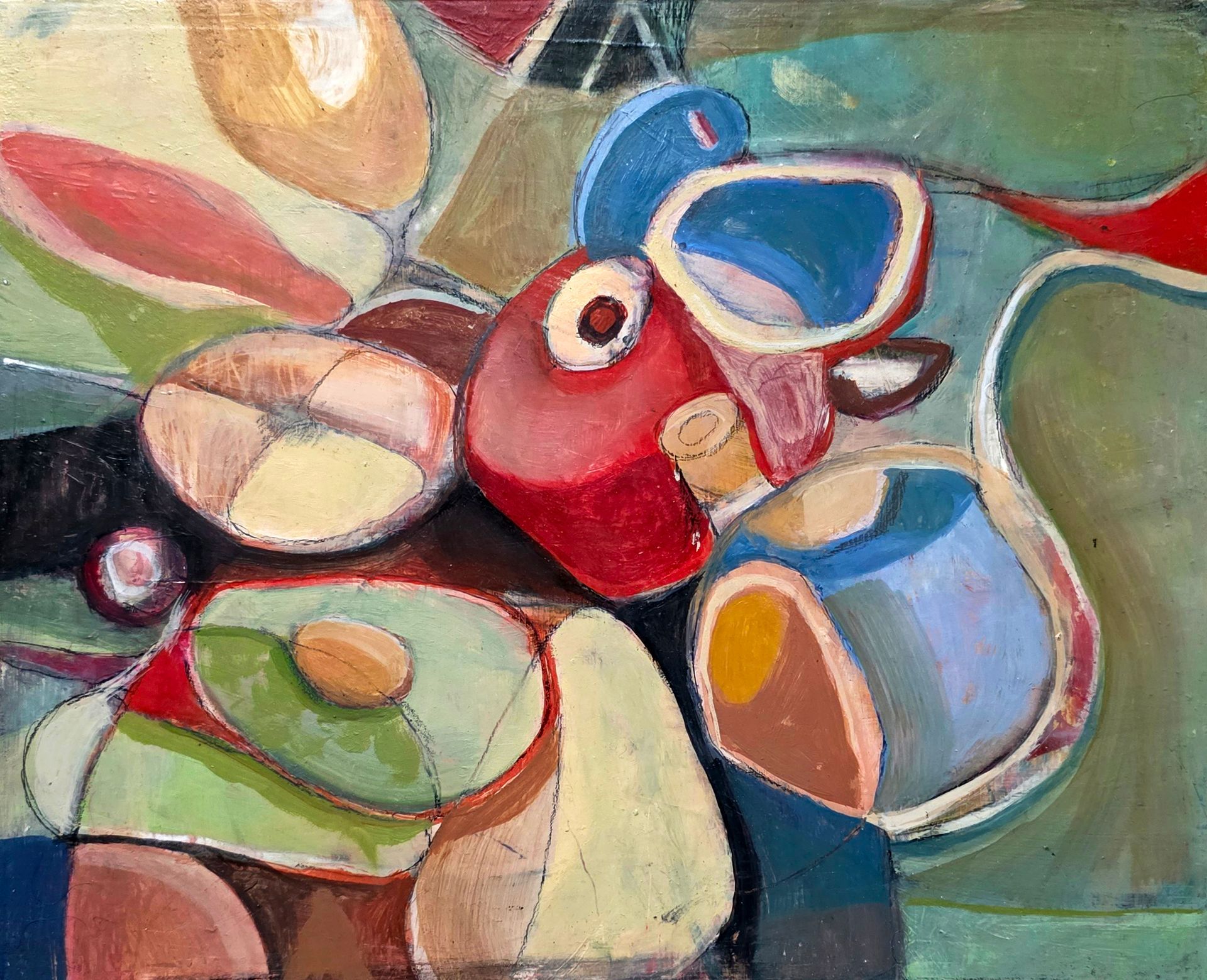
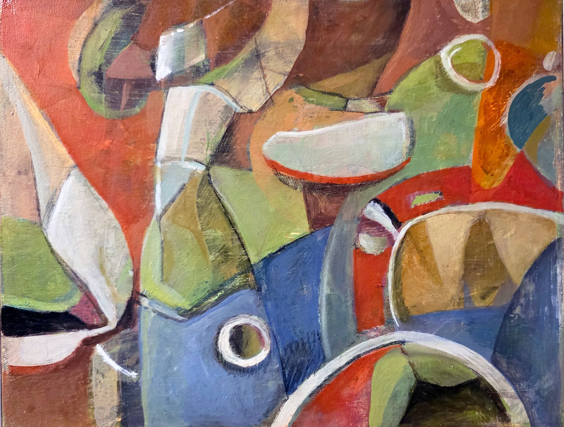
Small Format Painting - Color Study
Below is my small painting collection up to 24"X24" . Here Color is used structurally rather than descriptively. Muted earth tones—soft greens, ochres, creams, and browns—are punctuated by more saturated accents of red, blue, and yellow. These brighter notes act as focal points and visual anchors, guiding the eye across the composition. The layering of translucent and opaque passages creates depth, while also flattening space in places, producing a dynamic tension between foreground and background.
The composition is organized through diagonals and sweeping curves that suggest movement and rhythm. Circular forms appear repeatedly, almost like echoes, giving the painting a sense of cohesion. These forms feel as if they could be vessels or objects seen from multiple viewpoints, but they remain intentionally ambiguous.
There is a strong sense of plane shifting—areas advance and recede through subtle value changes and edge control rather than strict perspective. Some edges dissolve softly into neighboring shapes, while others are more defined, reinforcing structure without becoming rigid.
Overall, the painting balances intuition and control. It feels exploratory yet deliberate, with an emphasis on spatial relationships, color harmony, and the construction of form through abstraction rather than direct observation.